The Illusion of Wealth (Part I)
Gold vs Real Estate Returns & Which Asset Beat Inflation? The 100-Year Performance
This is Part I of the "Illusion of Wealth" series tracking 100 years of dollar value dilution.

Table of Contents
An analysis of Gold, Silver, US Real Estate, and UK Real Estate priced against the expansion of the M2 Money Supply.
Executive Summary
When analysing long-term investment performance, most observers look at nominal price increases or adjust for the Consumer Price Index (CPI). A more fundamental measure of value preservation, however, is how an asset performs against the expansion of the money supply itself.
Over the past 100 years, the US M2 money supply has expanded by an extraordinary 503x, massively diluting the purchasing power of each individual dollar [1]. This report analyses whether traditional “safe haven” assets (gold, silver, and real estate in both the US and UK) have genuinely appreciated in value, or if their rising prices are merely a reflection of a devalued currency.
The conclusion is clear: none of these major asset classes have genuinely appreciated when measured against monetary expansion. Whilst they have all seen massive nominal price increases, every single one has actually lost value relative to the rate of money printing over the last century.
1. The Great Dilution: The Collapse of the Dollar
Before analysing asset prices, we must first understand the baseline: the dilution of the currency itself.
Between 1926 and 2026, the US M2 money supply grew from approximately $43.7 billion to nearly $22 trillion [1] [2]. This represents a growth factor of 503x. Consequently, a dollar from 1926 now represents less than one-fifth of a cent ($0.0019) of the total monetary pool.
The chart below demonstrates how the value of $1 has collapsed purely due to monetary expansion, overlaid with the nominal price of the median US house.
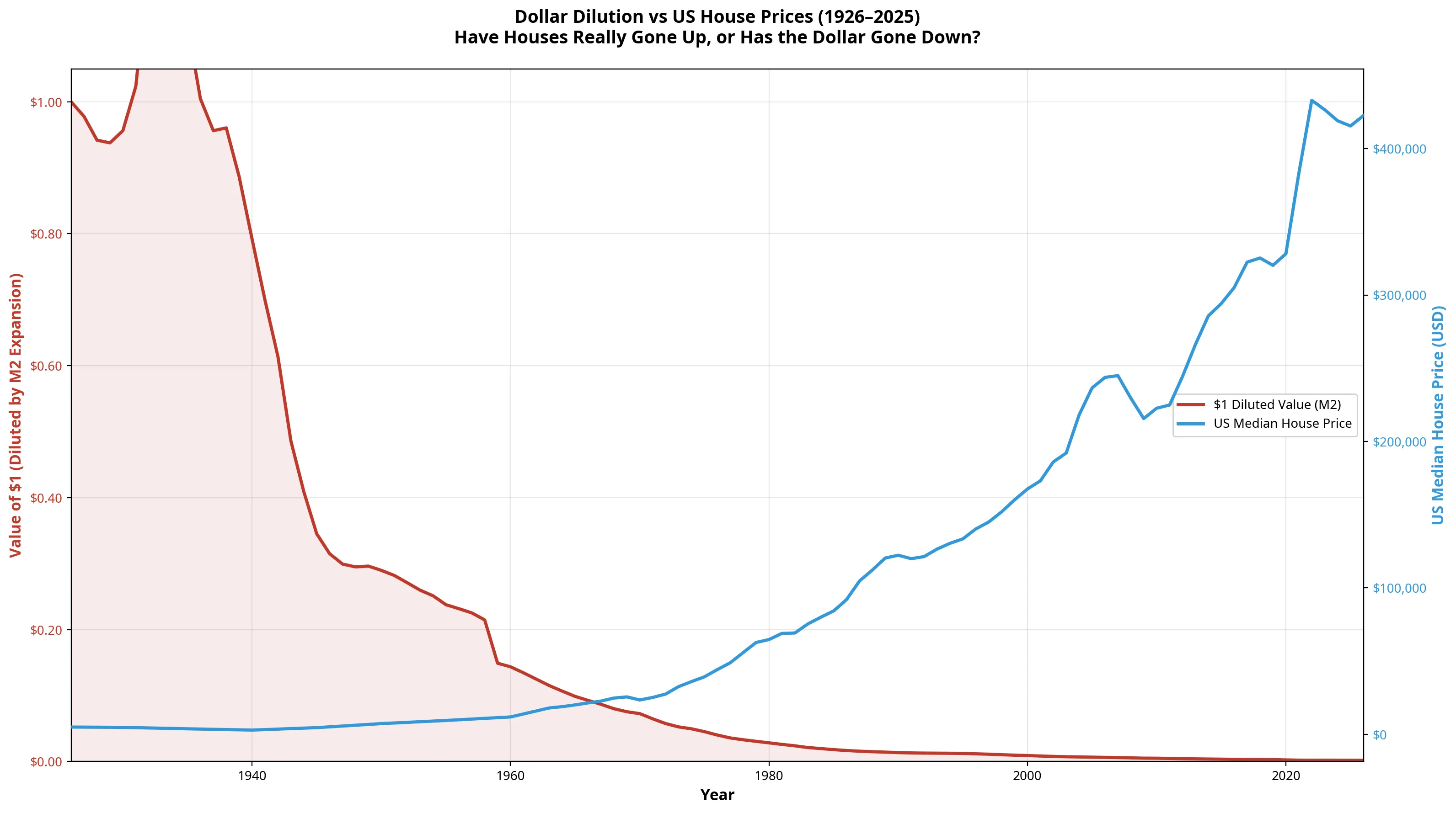
As the red area (the value of $1) collapses toward zero, the blue line (US house prices) inevitably rises to compensate for the currency’s lost purchasing power.
2. Nominal Growth vs. Real Growth
When we look at the raw numbers, the gains appear extraordinary. A house in the UK that cost £619 in 1926 now averages over £271,000 [3]. Gold, which was fixed at $20.67 an ounce, now trades near $3,500 [4].
However, when we place these nominal gains next to the expansion of the money supply, the illusion shatters.
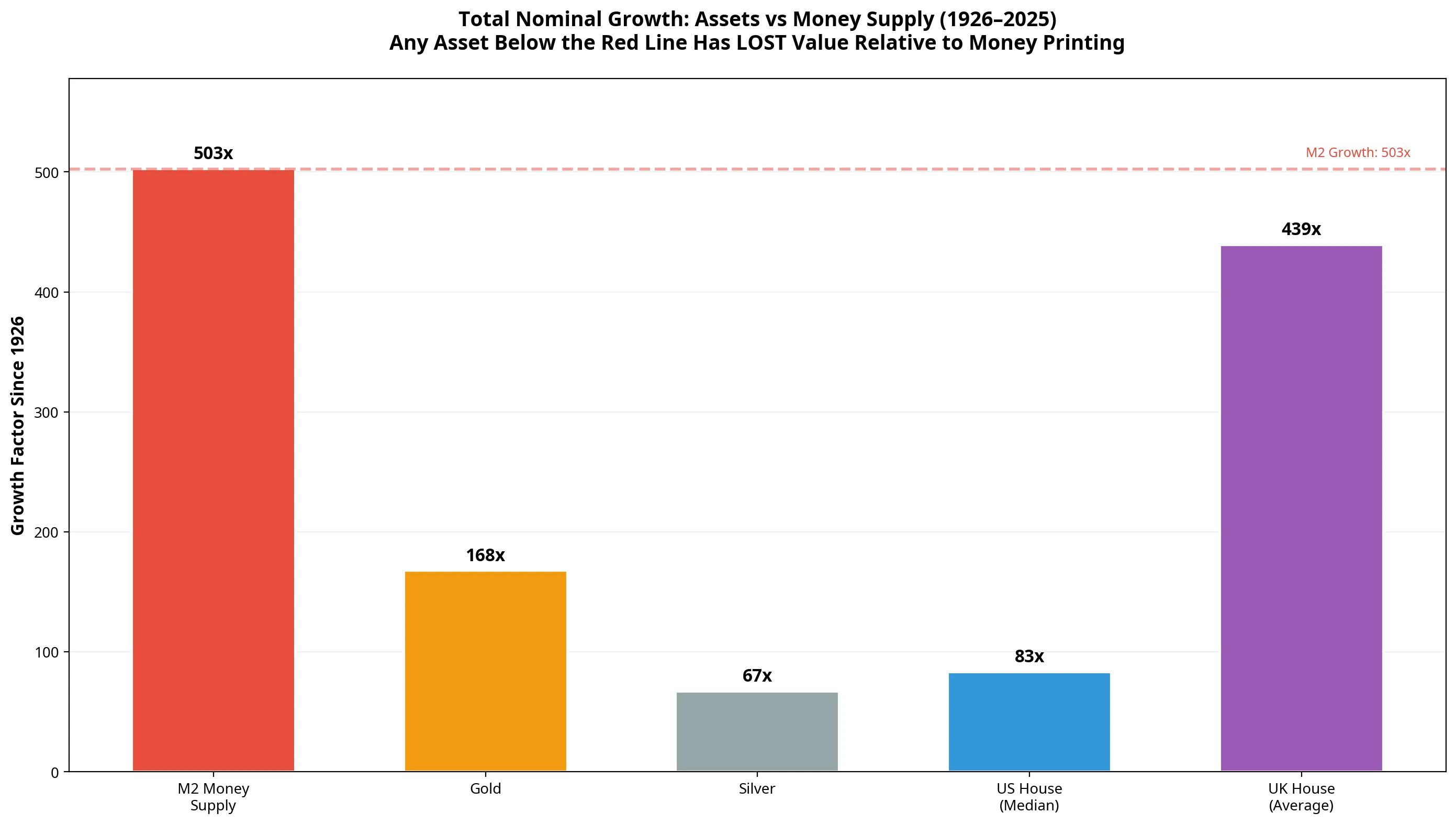
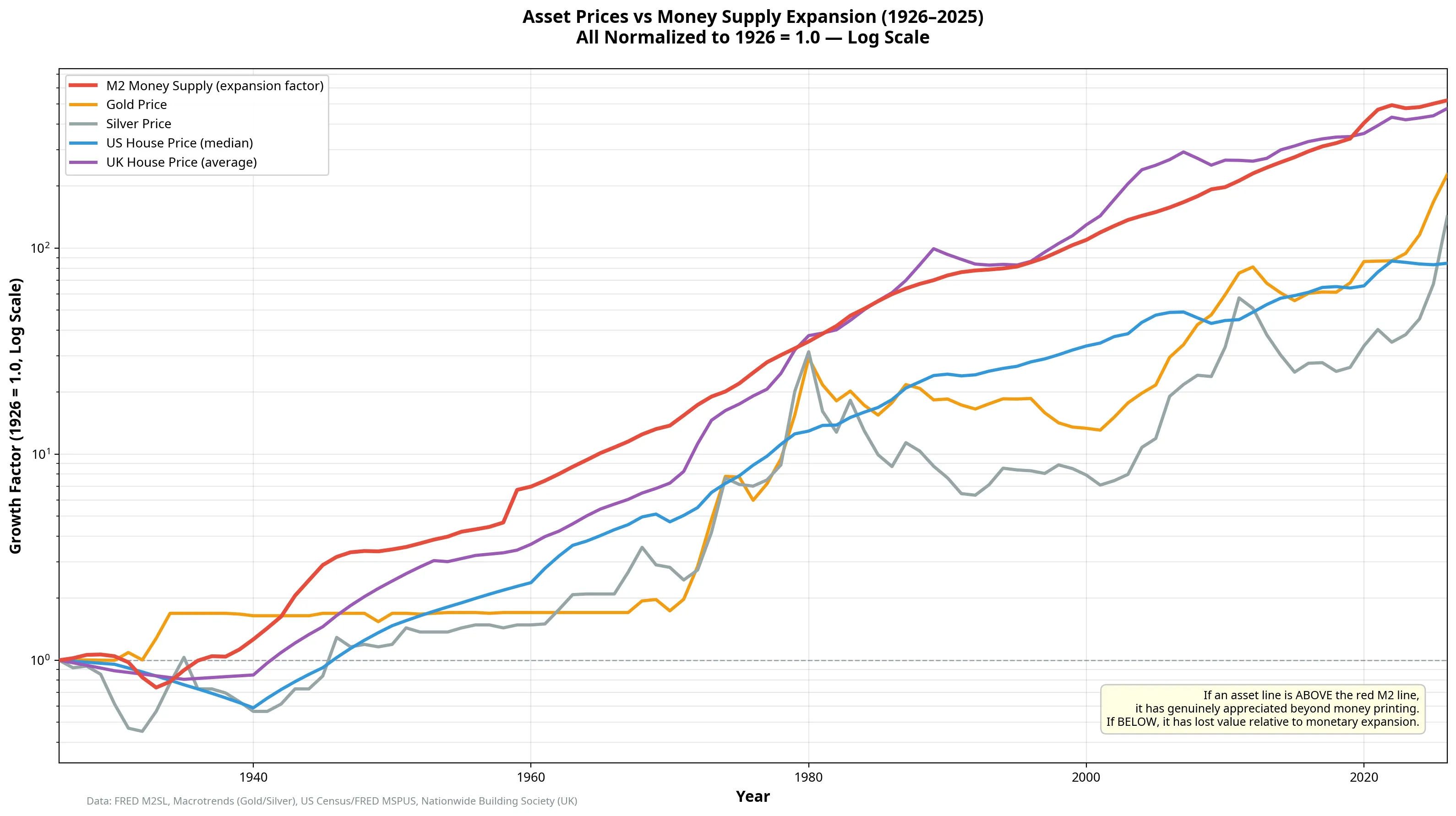
As the chart above illustrates, the M2 money supply has grown by 503x. For an asset to have merely broken even with the rate of money printing, its price would need to have increased by 503x since 1926.
Only UK Real Estate came close, growing by 439x, largely due to the severe constraints on housing supply in the United Kingdom compared to the United States. Gold grew by 168x, US real estate by 83x, and silver by just 67x [4] [5].
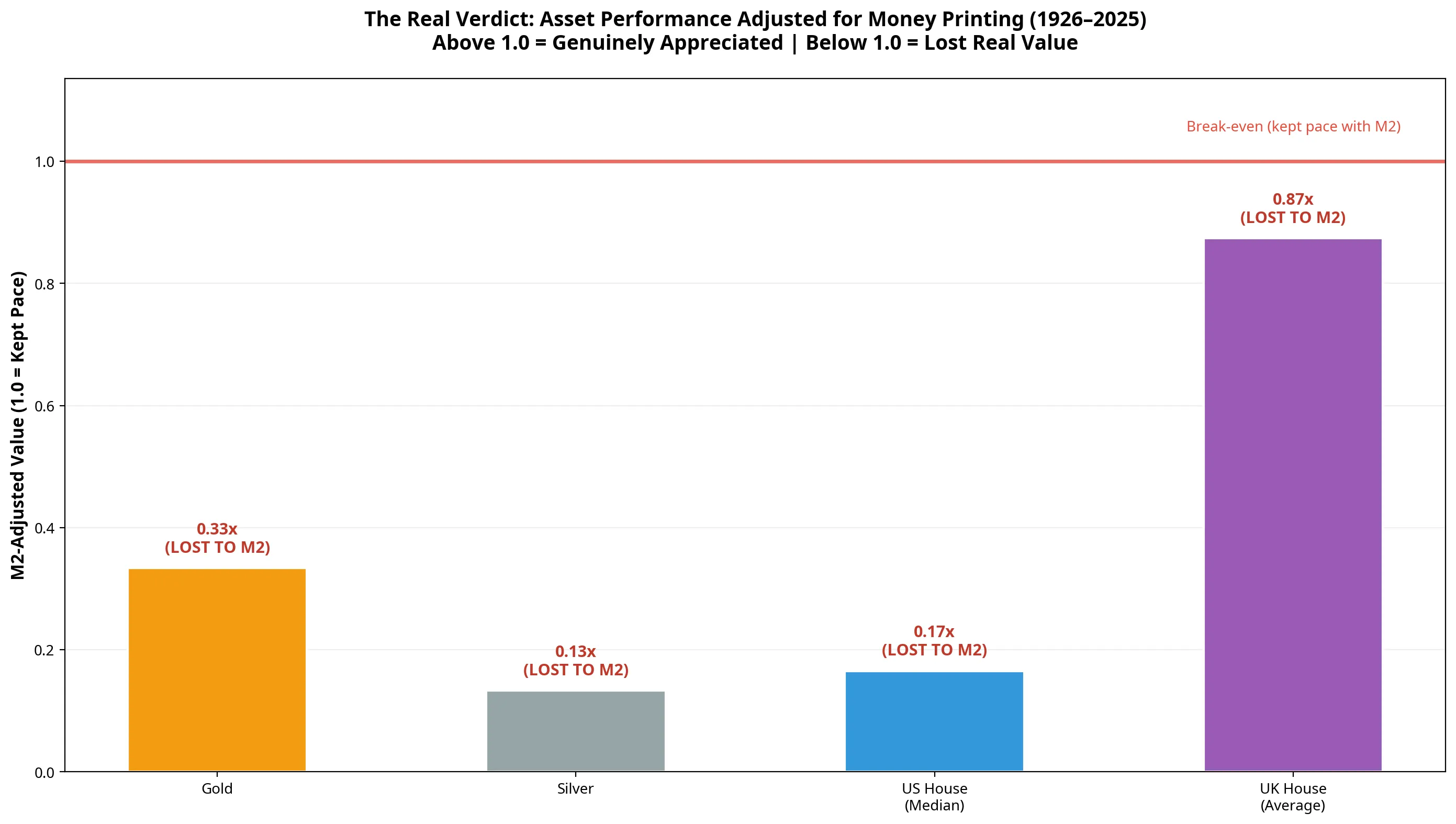
| Asset Class | 1926 Price | 2026 Price | Nominal Gain | M2-Adjusted Value | Verdict |
|---|---|---|---|---|---|
| M2 Money Supply | $43.7 Billion | $21,963 Billion | 503x | 1.00 | Baseline |
| UK House (Avg) | £619 | £271,809 | 439x | 0.87 | LOST |
| Gold | $20.72 / oz | $3,473 / oz | 168x | 0.33 | LOST |
| US House (Median) | $5,000 | $415,400 | 83x | 0.17 | LOST |
| Silver | $0.62 / oz | $41.50 / oz | 67x | 0.13 | LOST |
3. The Real Verdict: M2-Adjusted Performance
To visualise this dynamic, we can normalise all assets to a starting value of 1.0 in 1926, and then divide their performance by the M2 money supply expansion.
If the resulting line is above 1.0, the asset has genuinely appreciated, creating real wealth beyond the rate of money printing. If the line is below 1.0, the asset has lost purchasing power relative to the total monetary pool.
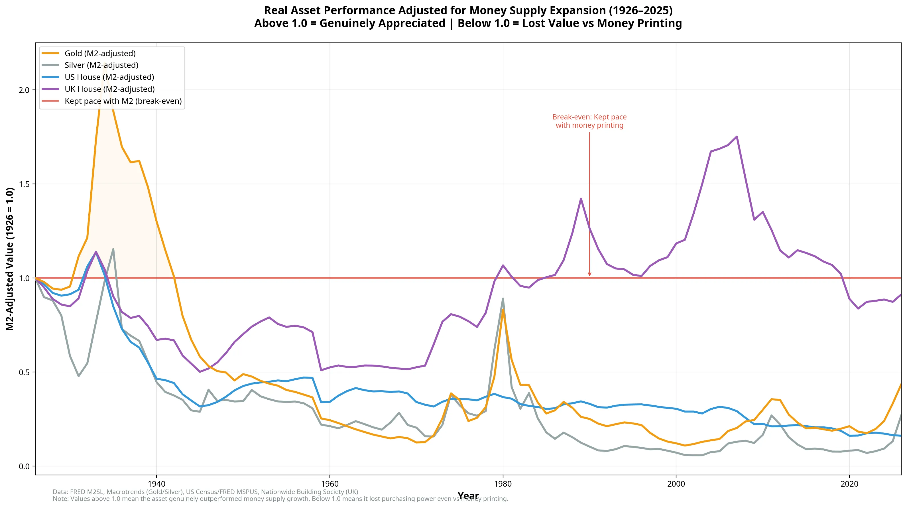
Key Observations from the M2-Adjusted Data:
- The 1970s Gold Shock: The only time gold genuinely outperformed monetary expansion was during the inflation shocks of the late 1970s and early 1980s, peaking in 1980 when it briefly doubled its relative purchasing power [4].
- The UK Housing Anomaly: UK real estate is the best performing asset in this cohort. During the housing bubbles of the late 1980s and mid-2000s, UK houses actually outpaced money printing [3]. However, since the 2008 financial crisis and the subsequent era of Quantitative Easing, even UK real estate has fallen below the break-even line.
- The US Housing Reality: Despite the perception that US real estate is a wealth-generating engine, the median US home has consistently lost value relative to monetary expansion since the 1930s. The massive nominal price increases seen by homeowners are entirely an illusion created by the devaluation of the dollar [2].
4. The Ultimate Test: Pricing Houses in Gold
If fiat currency is a broken measuring stick, what happens if we measure the price of a house using another hard asset?
When we price the median US house in ounces of gold, a fascinating pattern emerges: The “price” of a house has remained remarkably stable over the last century.
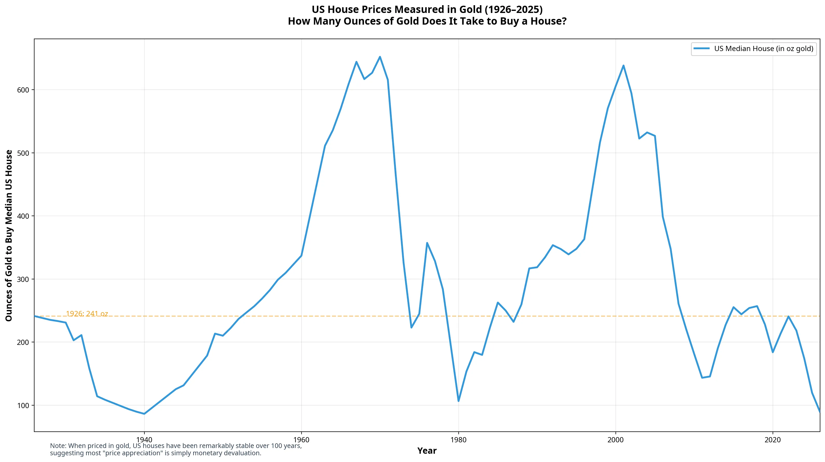
In 1926, it took approximately 241 ounces of gold to buy the median US house. Today, it takes roughly 120 ounces. In other words, when measured in gold, houses are actually cheaper today than they were a century ago, despite the nominal dollar price rising from $5,000 to over $415,000.
This proves definitively that the “appreciation” of real estate is almost entirely a function of the denominator (the fiat currency) collapsing, rather than the numerator (the house) becoming inherently more valuable.
Conclusion
The data reveals a sobering truth about modern finance: We are not getting richer; our money is getting weaker.
When investors celebrate their home doubling in value over 15 years, or gold hitting new all-time highs, they are largely observing the destruction of their currency’s purchasing power. Whilst holding these assets is vastly superior to holding cash (which absorbed the full 99.8% dilution), none of them have actually kept pace with the sheer volume of new money created by central banks over the last century.
To genuinely build wealth in an era of fiat currency, an asset must not only go up in nominal terms; it must appreciate faster than the rate at which new money is printed. History shows that traditional safe havens have failed this ultimate test.
References
[1] Federal Reserve Economic Data (FRED). “M2 Money Supply (M2SL).” Federal Reserve Bank of St. Louis. [2] Federal Reserve Economic Data (FRED). “Median Sales Price of Houses Sold for the United States (MSPUS).” Federal Reserve Bank of St. Louis. [3] Nationwide Building Society. “UK House Price Index - Historical Data.” [4] Macrotrends. “Gold Prices - 100 Year Historical Chart.” [5] Macrotrends. “Silver Prices - 100 Year Historical Chart.”