The Illusion of Wealth (Part II)
Stocks vs Inflation: Does the Stock Market Beat Inflation? Avoid the Savings Trap
This is Part II of the "Illusion of Wealth" series tracking 100 years of dollar value dilution.

Table of Contents
An analysis of the S&P 500, the Dow Jones, historical market crashes, and the myth of the savings account, priced against the expansion of the M2 Money Supply.
Executive Summary
In Part I, we established that traditional safe-haven assets, gold, silver, and real estate, have all failed to outpace the 503x expansion of the US M2 money supply over the last century.
This second part of the analysis turns to the stock market, historical market crashes, and cash savings. The central hypothesis tested here is whether the stock market genuinely creates wealth, whether “bubbles” are isolated phenomena or simply monetary symptoms, and whether the concept of “earning interest” in a savings account is mathematically sound.
The findings are striking: Over a 100-year timeframe, even the mighty S&P 500 has failed to fully outpace money printing. Beyond that, historical market crashes closely track periods of monetary tightening, and cash savings, despite appearing to grow nominally, have resulted in a near-total destruction of purchasing power.
Section A: Stock Indices vs Money Supply
The stock market is widely considered the ultimate wealth-generation engine. To test this, we compared the nominal growth of the S&P 500 and the Dow Jones Industrial Average against the M2 money supply from 1926 to 2025 [1] [2] [3].
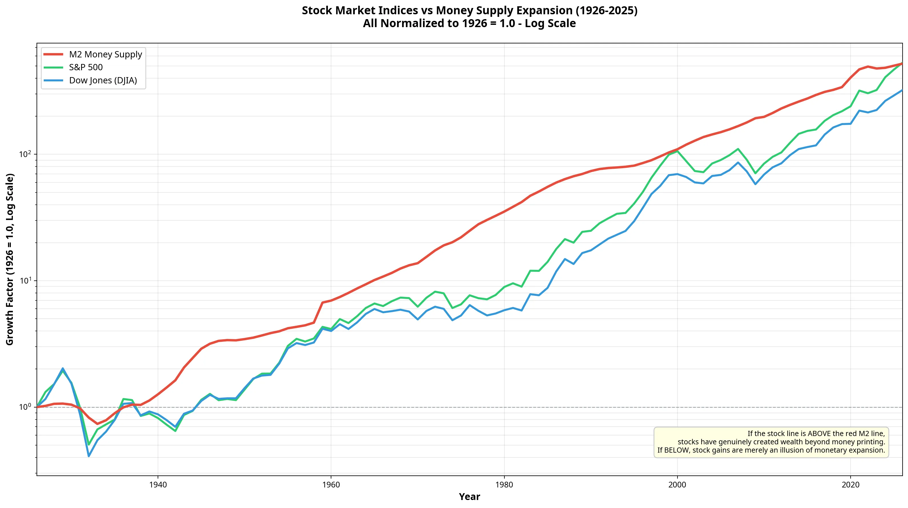
When viewed on a logarithmic scale, the correlation between stock prices and money supply expansion is unmistakable.
The Nominal Illusion
In nominal terms, the stock market’s performance looks spectacular. The S&P 500 grew from an annual average of 13.40 in 1926 to over 6,276 in 2025, a massive 468x nominal gain. The Dow Jones grew by 292x over the same period.
However, during this exact same window, the M2 money supply expanded by 503x.
When we adjust stock market performance for this monetary dilution, the picture changes dramatically. To genuinely create wealth beyond the rate of currency debasement, an asset’s M2-adjusted value must remain above 1.0.
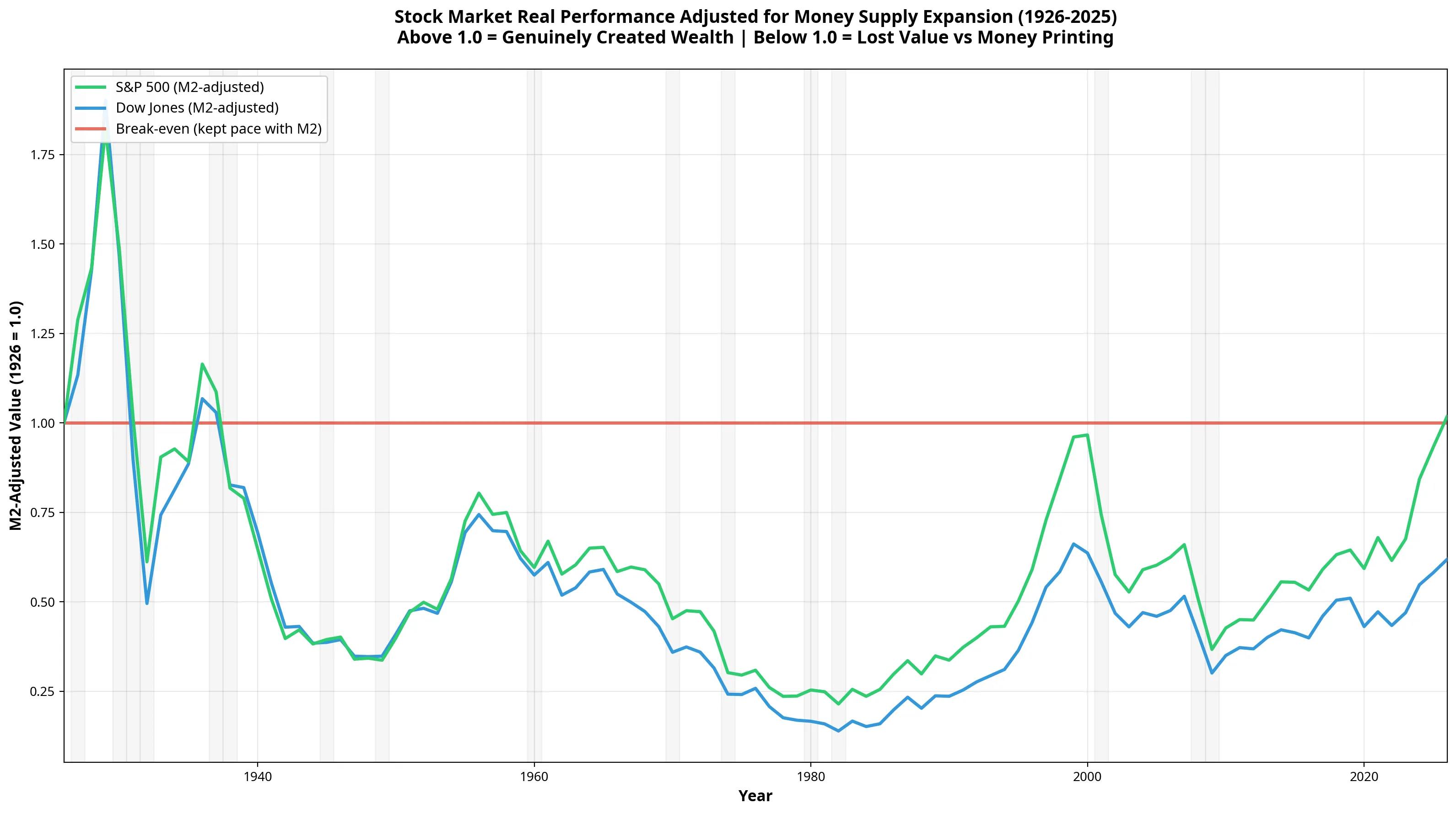
As the chart above demonstrates, neither the S&P 500 nor the Dow Jones has managed to stay above the 1.0 break-even line over the full century. The S&P 500 currently sits at an M2-adjusted value of 0.932, meaning it has lost roughly 6.8% of its value relative to the total monetary pool. The Dow Jones has fared much worse, losing over 40% of its relative value.
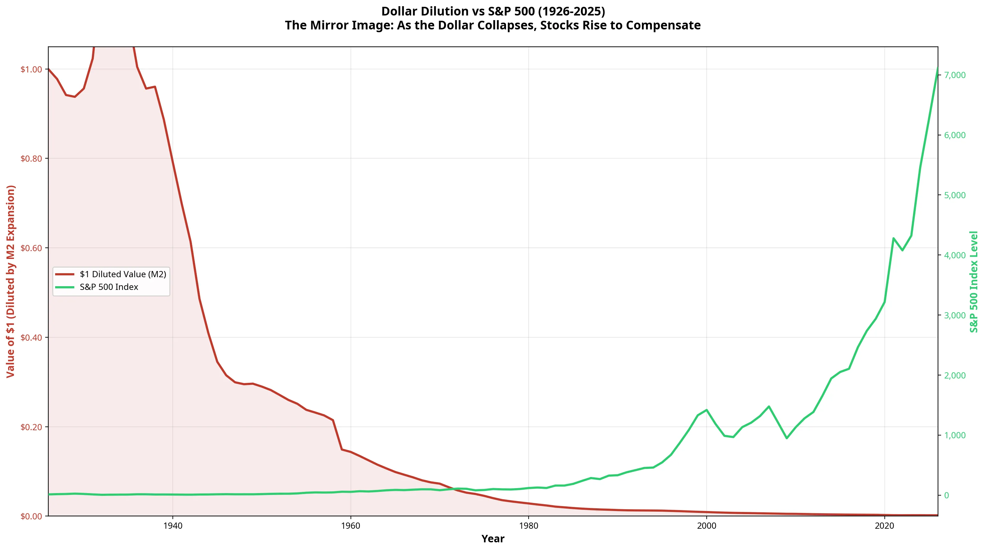
Whilst stocks have preserved wealth far better than cash or precious metals, their legendary “growth” is largely the mirror image of a collapsing currency.
Section B: Bubbles, Crashes, and Money Printing
Financial media often portrays market bubbles, such as the Dot-com boom or the 2008 housing crisis, as isolated events driven by irrational exuberance or specific sector failures. However, when we map these events against the rate of money supply growth, a different narrative emerges.
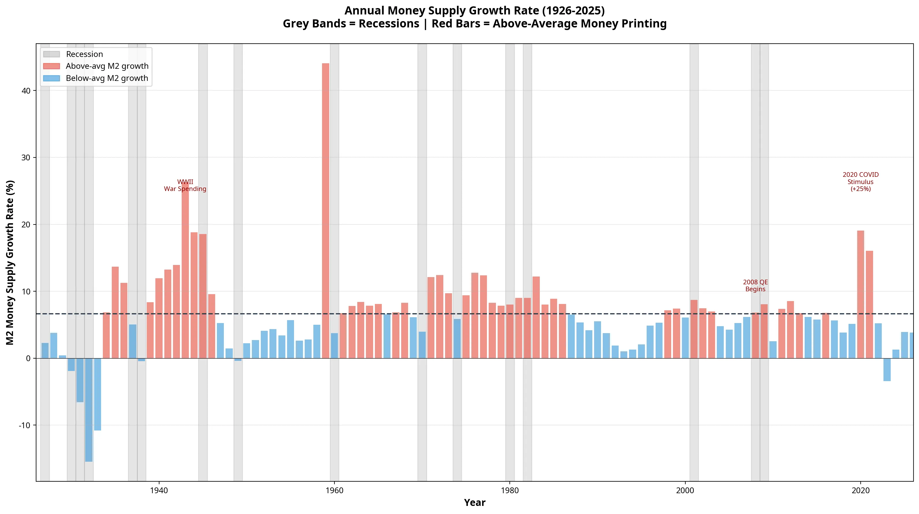
The historical average for M2 growth is approximately 6.66% per year. When we look at the data, major market crashes frequently follow periods where monetary expansion slows down or dips below this average. Conversely, major “recoveries” are almost entirely fuelled by aggressive new money printing, such as the Quantitative Easing (QE) era post-2008 or the massive stimulus of 2020.
The Bubble Illusion
This dynamic creates what we can call the “Bubble Illusion.”
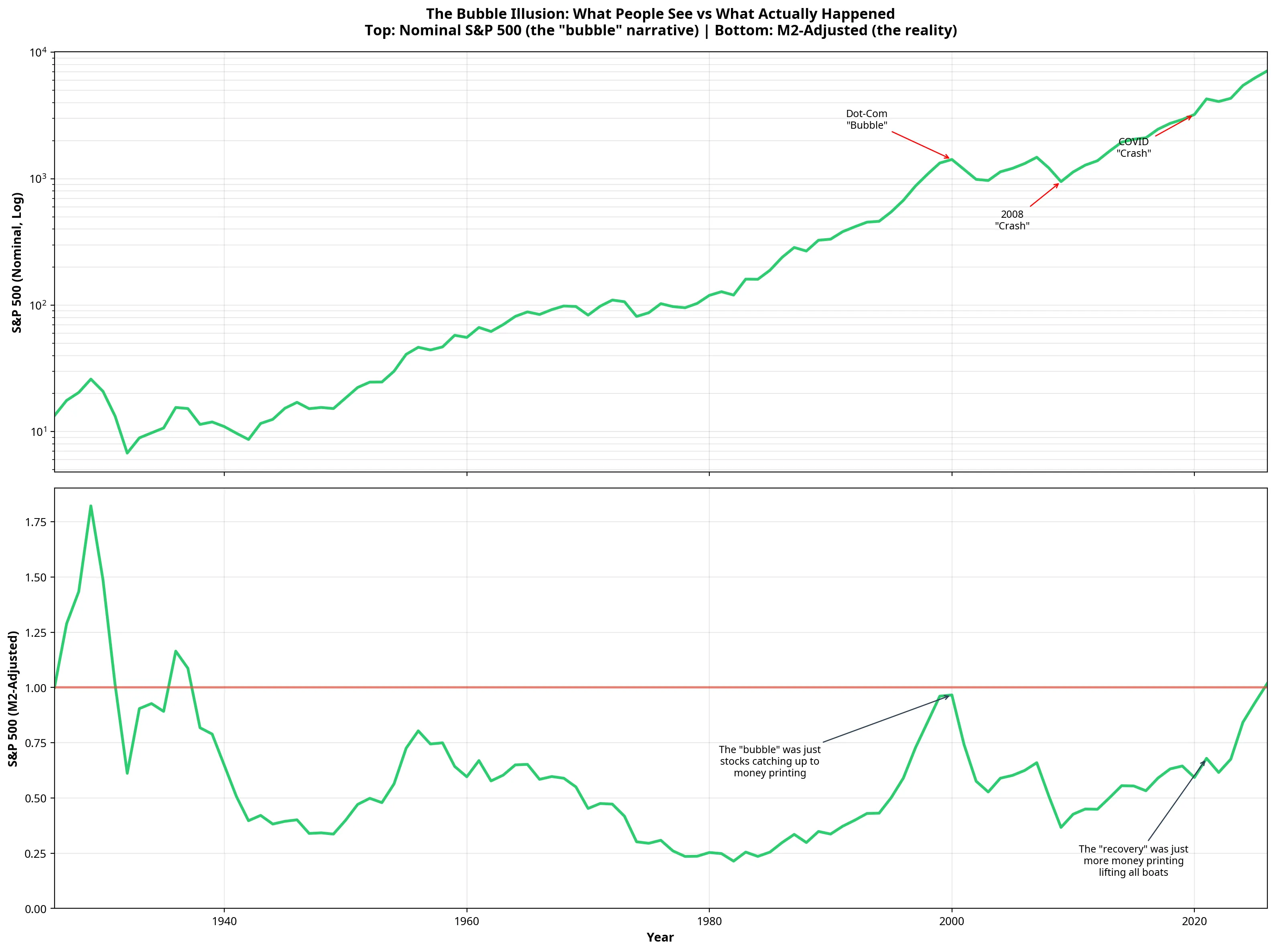
Look at the Dot-com “bubble” of the late 1990s. In nominal terms (top chart), it looks like an extreme deviation from the trend. But in M2-adjusted terms (bottom chart), the late 1990s was simply the only time in recent history where the S&P 500 managed to briefly catch back up to the rate of money printing, touching the 1.0 break-even line before falling away again.
Similarly, the post-2009 “longest bull run in history” and the rapid recovery from the 2020 COVID crash do not represent a sudden surge in corporate value. They represent the stock market re-pricing itself upward to absorb the trillions of new dollars injected into the system. The “recovery” is just more money printing lifting all boats.
Section C: The Savings Account Trap
Perhaps the most pervasive financial myth is that putting money in a savings account that yields 4% or 5% means you are “earning money.” This belief relies on the assumption that official CPI inflation (typically targeted at 2-4%) is the true measure of currency devaluation.
Our hypothesis was that true inflation, measured by monetary expansion, is much higher, meaning traditional savings accounts guarantee a loss of wealth. The data proves this hypothesis to be entirely correct.
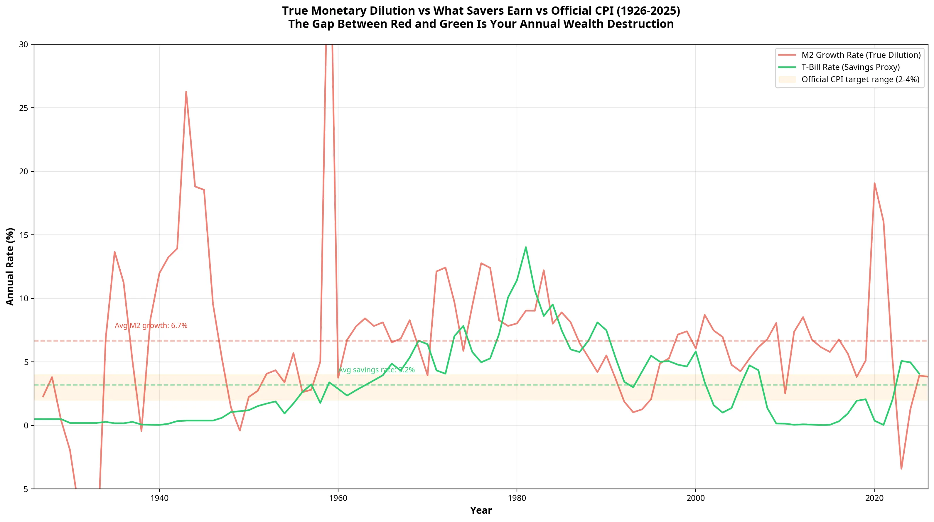
Using the 3-Month Treasury Bill rate as a proxy for the best available safe savings yield [4], we found that the average savings rate over the last 100 years was 3.17%.
However, the average annual M2 growth rate, the true rate of monetary dilution, was 6.66%.
This means that, on average, a saver has lost 3.48% of their wealth every single year for a century, simply by holding cash in a bank. The gap between the red line (money printing) and the green line (interest earned) in the chart above represents pure wealth destruction.
The Death of the Saver
To visualise this, we tracked a hypothetical $1 deposited in a savings account in 1926, reinvesting the interest every year until 2025.
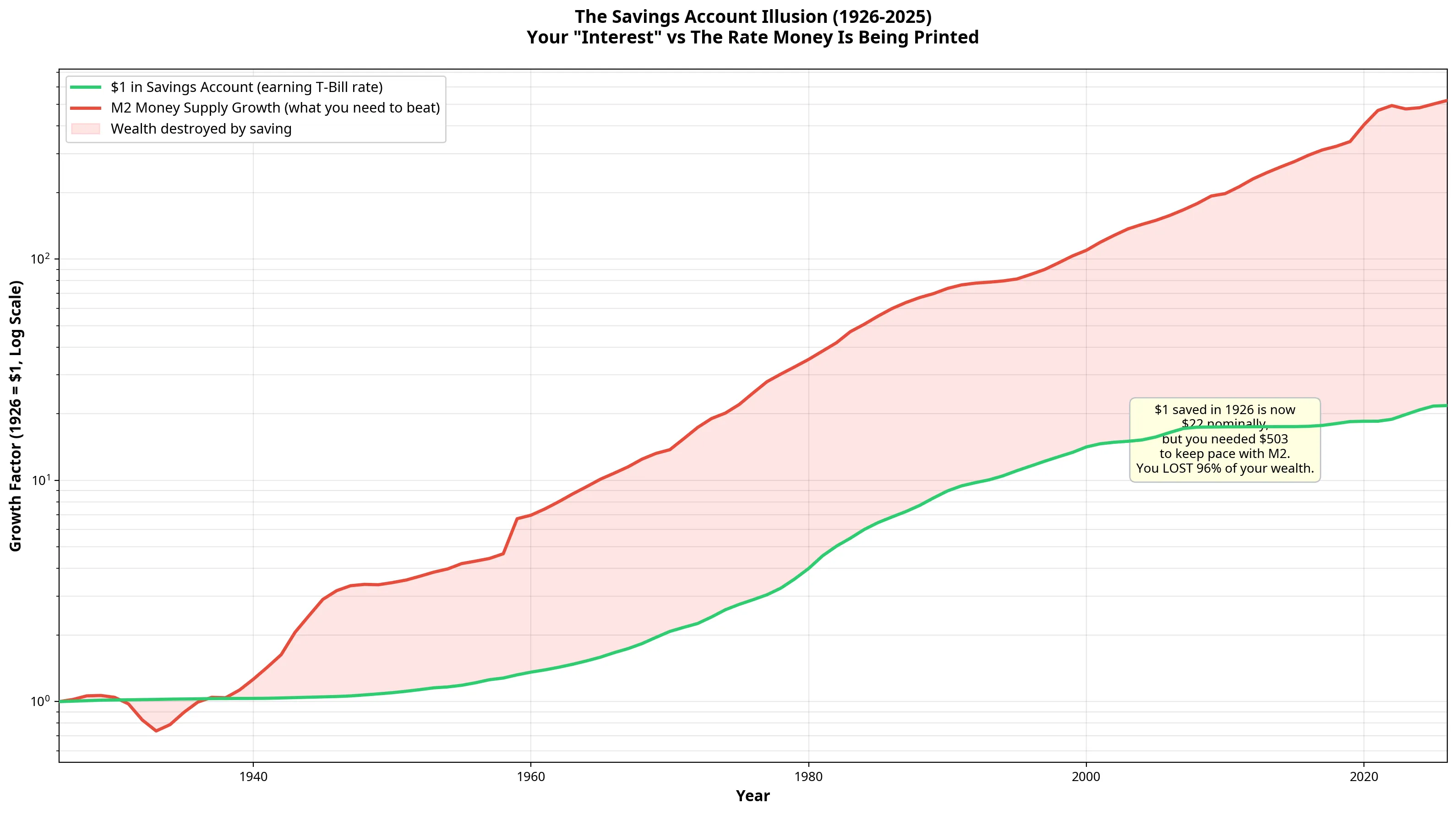
Nominally, the saver feels victorious. Their $1 has grown to $21.68.
But to merely maintain their 1926 purchasing power against the expanded money supply, that account needed to grow to $503.
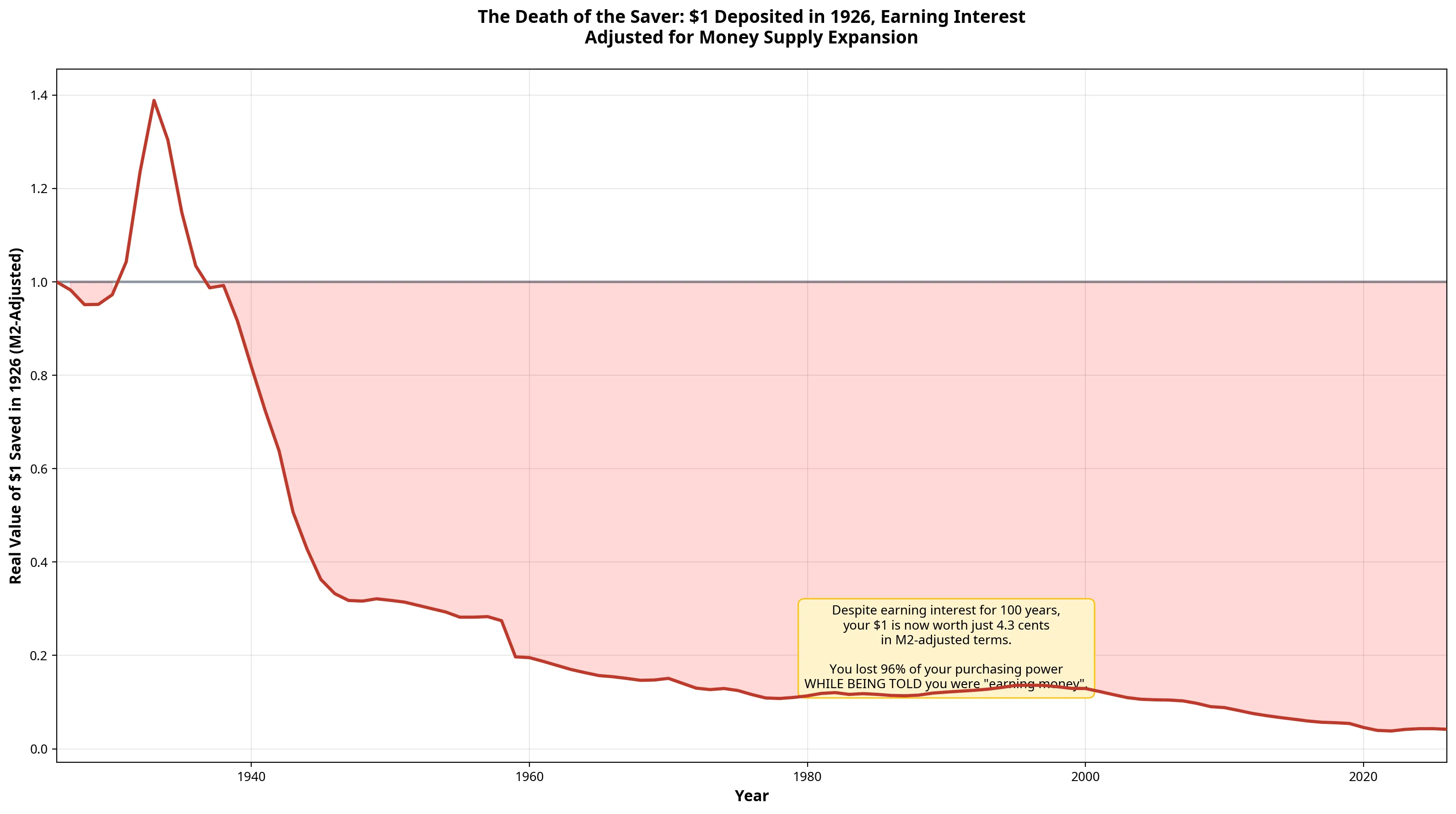
When adjusted for M2 expansion, that $1 is now worth just 4.3 cents. Despite “earning interest” for 100 years, the saver has lost nearly 96% of their wealth.
Conclusion: The Full Picture
When we put all the strategies together, the reality of the fiat monetary system becomes impossible to ignore.
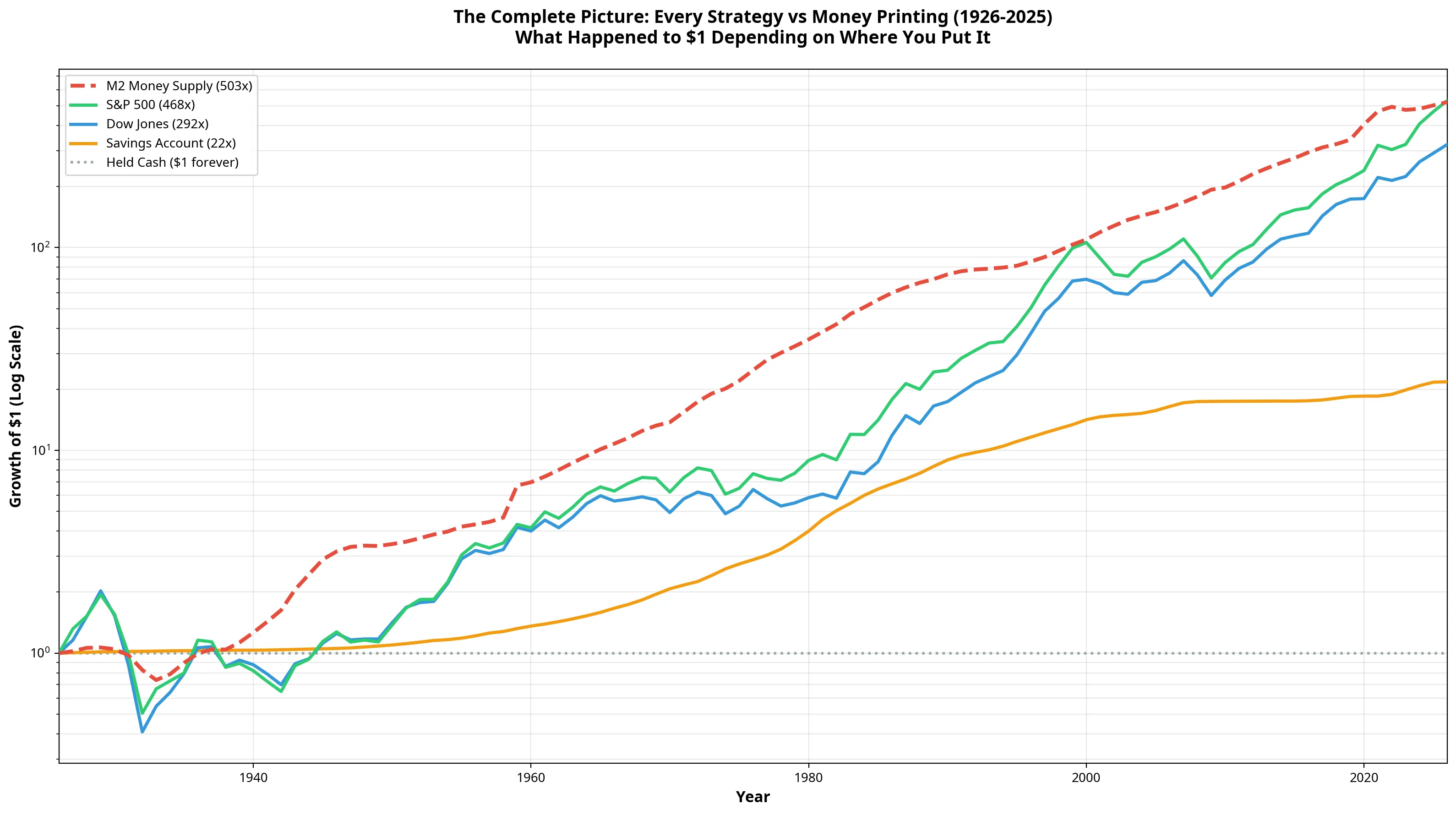
| Strategy | Nominal Gain | M2-Adjusted | Verdict |
|---|---|---|---|
| M2 Money Supply | 503x | 1.000 | BASELINE |
| S&P 500 | 468x | 0.932 | LOST |
| Dow Jones | 292x | 0.581 | LOST |
| Savings Account | 22x | 0.043 | LOST MASSIVELY |
| Held Cash Under Mattress | 1x | 0.002 | LOST EVERYTHING |
None of the traditional financial strategies, not even the S&P 500, have managed to outrun the printing press over a 100-year timeframe.
The stock market is not primarily a wealth-creation machine. It is a wealth-preservation mechanism that attempts, and slightly fails, to keep pace with currency devaluation. Market crashes are largely symptoms of central bank tightening, and cash savings are a guaranteed path to poverty.
In the next phase of this analysis, we will zoom in on the last 20 to 60 years to examine newer assets, including the Nasdaq, the MSCI All World index, and Bitcoin, to see if the digital age has finally provided an asset capable of outrunning the expansion of the money supply.
References
[1] Federal Reserve Economic Data (FRED). “M2 Money Supply (M2SL).” Federal Reserve Bank of St. Louis. [2] Macrotrends. “S&P 500 - 100 Year Historical Chart.” [3] Macrotrends. “Dow Jones - 100 Year Historical Chart.” [4] Federal Reserve Economic Data (FRED). “3-Month Treasury Bill Secondary Market Rate (TB3MS).” Federal Reserve Bank of St. Louis.