


Key takeaways
- Berkshire Hathaway grew 50,981x from 1965 while M2 grew 50x, which still leaves an M2-adjusted return of 1,027x, or 19.8% a year compounded over 60 years.
- Walmart came closest, and from its 1970 listing it was effectively level with Berkshire at 1,024x M2-adjusted with a 21.1% CAGR.
- Over the same 60 years the S&P 500 total return turned $10,000 into roughly $3 million at 10.0% a year, which is only 6.1x once M2 growth is taken out.
- The research on long-run IPO outcomes that we used suggests around 30-35% go to zero or are delisted within 10 to 20 years, and that only about 10-15% end up beating both the S&P 500 and money supply growth.
- The average retail investor picking their own stocks managed roughly a 5% CAGR, which sits below the 6.56% rate of monetary expansion.
The question in Part IV of The Illusion of Wealth is how good Warren Buffett’s returns really were once you adjust for money printing, and whether an ordinary investor could have done as well by picking the right IPOs, so we compare Berkshire Hathaway’s 60-year record with Walmart, Home Depot, McDonald’s, Nike, Costco and Starbucks from their listing dates, and with the S&P 500, measuring all of them against the growth of the US M2 money supply over the same years.
Executive Summary
In Part III we arrived at what we called The 6.56% Rule, which we came to see as the basic mathematical law of 20th-century wealth creation, in that any asset compounding above the average monetary expansion rate of 6.56% beat the printing press and anything compounding below it lost ground. Berkshire Hathaway, under Warren Buffett’s management, was the clearest proof of that rule we found, because it compounded at 19.8% a year for 60 years.
That left us with a question Berkshire on its own could not answer. Was it the only way to win, or could an investor have simply picked the right “old economy” stocks at their Initial Public Offerings (IPOs) and ended up in the same place?
So in this fourth part we look at the generational non-tech IPO winners, from McDonald’s and Walmart to Home Depot and Nike, and set each of them against both the money supply and Berkshire Hathaway. What the data showed us is that picking the right IPOs did yield astronomical returns, but survivorship bias makes it an almost impossible strategy to carry out in reality.
The Non-Tech IPO Winners: Beating the Printing Press
Anyone who had owned a crystal ball in the second half of the 20th century would not have needed Berkshire Hathaway to build generational wealth at all, because it would have been enough to spot the consumer brands that were going to dominate the American market and then hold them for decades.
The chart below plots the growth of these generational winners from their respective IPO dates, with each one starting at a baseline of 1.0.

Once we adjusted those returns for the expansion of the M2 money supply over each holding period, the results were striking:
| Stock | Start Year | Years Held | Nominal Growth | M2 Growth | M2-Adjusted Return | CAGR |
|---|---|---|---|---|---|---|
| Berkshire Hathaway | 1965 | 60 | 50,981x | 50x | 1,027x | 19.8% |
| Walmart | 1970 | 55 | 37,405x | 37x | 1,024x | 21.1% |
| Home Depot | 1981 | 44 | 10,798x | 13x | 826x | 23.5% |
| McDonald’s | 1965 | 60 | 37,720x | 50x | 760x | 19.2% |
| Nike | 1980 | 45 | 10,326x | 14x | 724x | 22.8% |
| Costco | 1985 | 40 | 776x | 9x | 85x | 18.1% |
| Starbucks | 1992 | 33 | 271x | 6x | 42x | 18.5% |
| S&P 500 Total Return | 1965 | 60 | 304x | 50x | 6.1x | 10.0% |
Data sourced from historical split-adjusted pricing [1] [2] [3]. M2 adjusted values indicate how many times the asset outpaced the money supply.
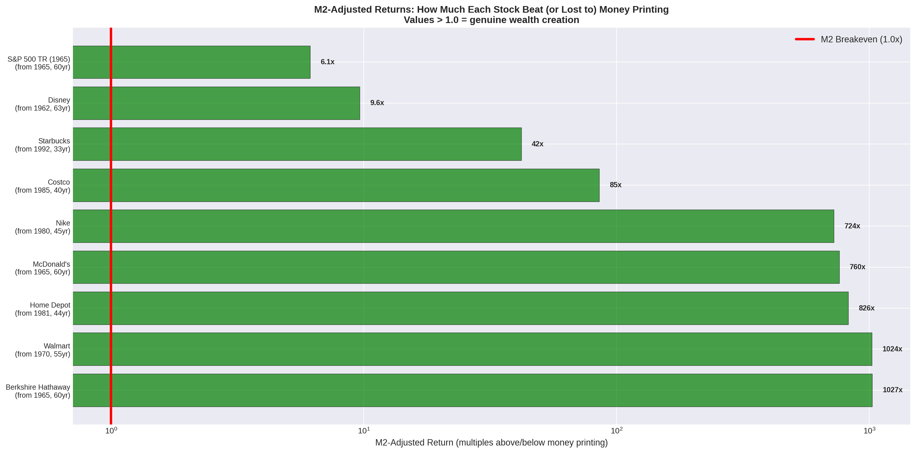
What the table tells us is that Walmart and Berkshire Hathaway finished in a dead heat for the title of the greatest wealth creator of the pre-digital era, with each of them multiplying an investor’s true purchasing power by more than 1,000 times even after we had accounted for the massive expansion of the money supply over those decades.
The Survivorship Bias Problem
Looking at the table above, it is tempting to conclude that the path to wealth was simply to buy good companies at their IPOs, and that temptation is a classic example of survivorship bias at work.
The reason is that we are looking at the handful of companies that survived, thrived and came to define global commerce, while the thousands of retail chains, restaurant concepts and apparel brands that went bankrupt during the same period never made it into the table.
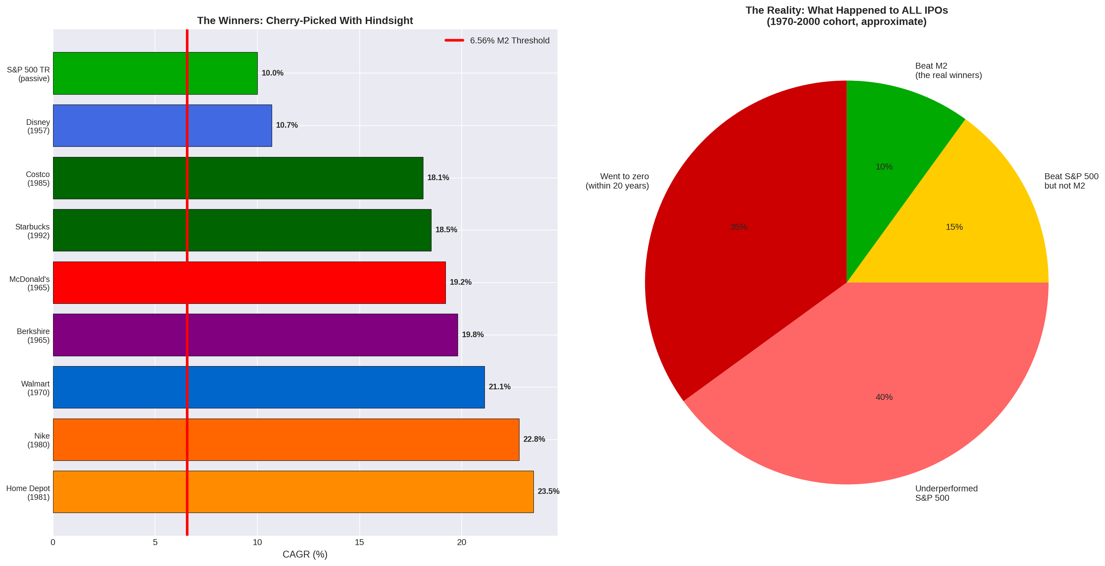
The research into long-term IPO performance that we used paints a grim picture for the stock-picker [4] [5]:
- Approximately 30–35% of IPOs go to zero or are delisted within 10 to 20 years.
- Another 40% underperform the S&P 500 over the long term.
- Only about 10–15% manage to beat the S&P 500 and outpace the expansion of the money supply (the 6.56% threshold).
To win the IPO game, then, an investor first had to find the needle in the haystack, and even that was only the start, because they also had to hold it through multiple recessions and market crashes (as explored in Part II) and resist the urge to sell once the stock had doubled or tripled.
The Berkshire Advantage: The Ultimate “ETF”
That brought us back to the central question, which was what the practical alternative looked like if picking individual IPO winners needed perfect hindsight.
The S&P 500 Total Return was one answer, since it passively turned $10,000 into roughly $3 million over 60 years and cleared the M2 threshold comfortably [6], but it got there at 10% a year, and Berkshire Hathaway offered something different again because it was not a single operating business like McDonald’s or Home Depot, so it was never tied to the changing tastes of one set of consumers or to disruption in one specific industry.
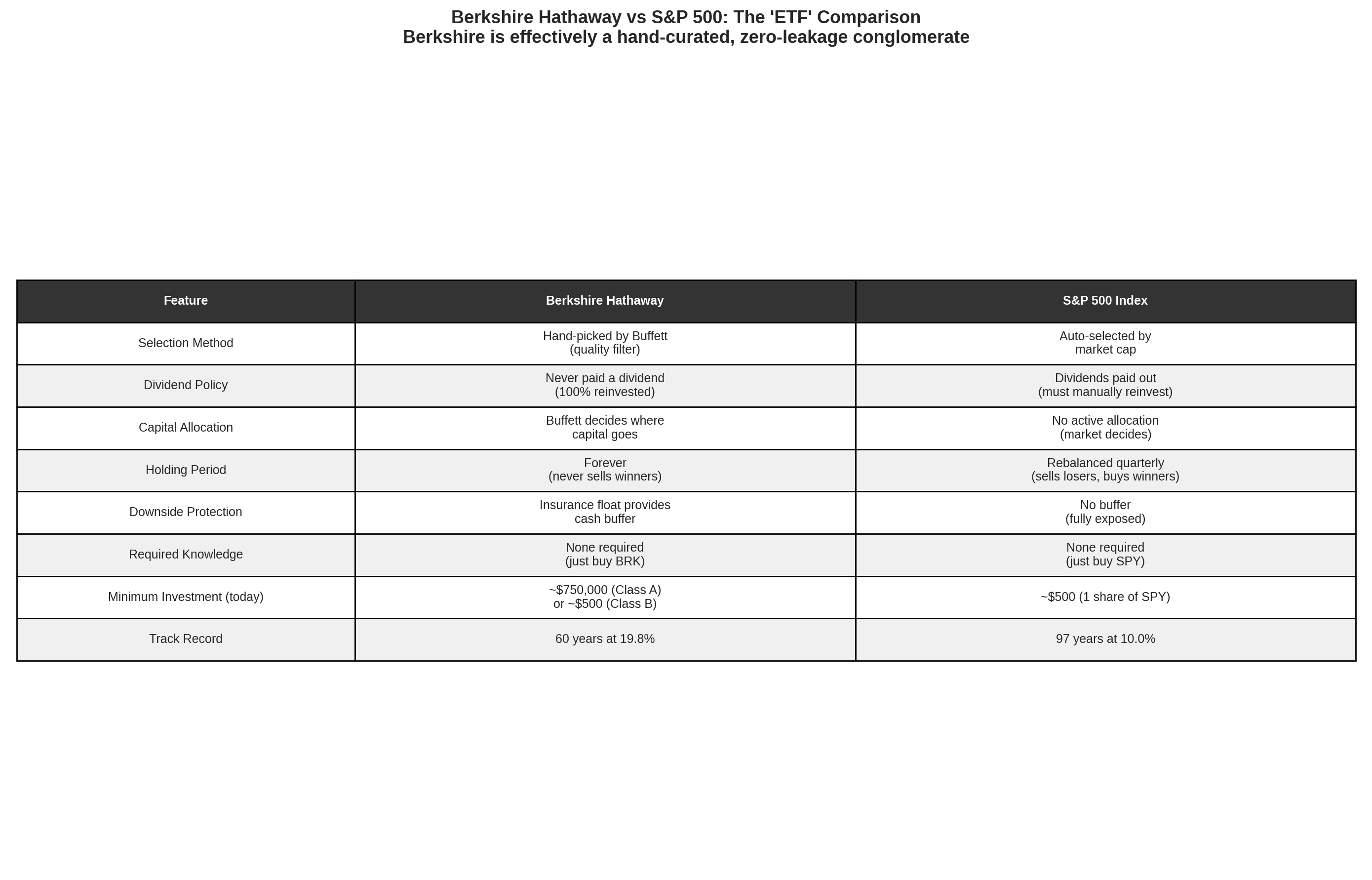
The way we came to think about it, Berkshire was effectively a hand-curated ETF (Exchange Traded Fund) managed by a man many regard as the greatest capital allocator in history.
- It required no stock-picking skill from the retail investor.
- It suffered from zero dividend leakage, as Buffett reinvested 100% of the profits tax-free within the corporate structure.
- It used insurance float to provide downside protection and leverage.
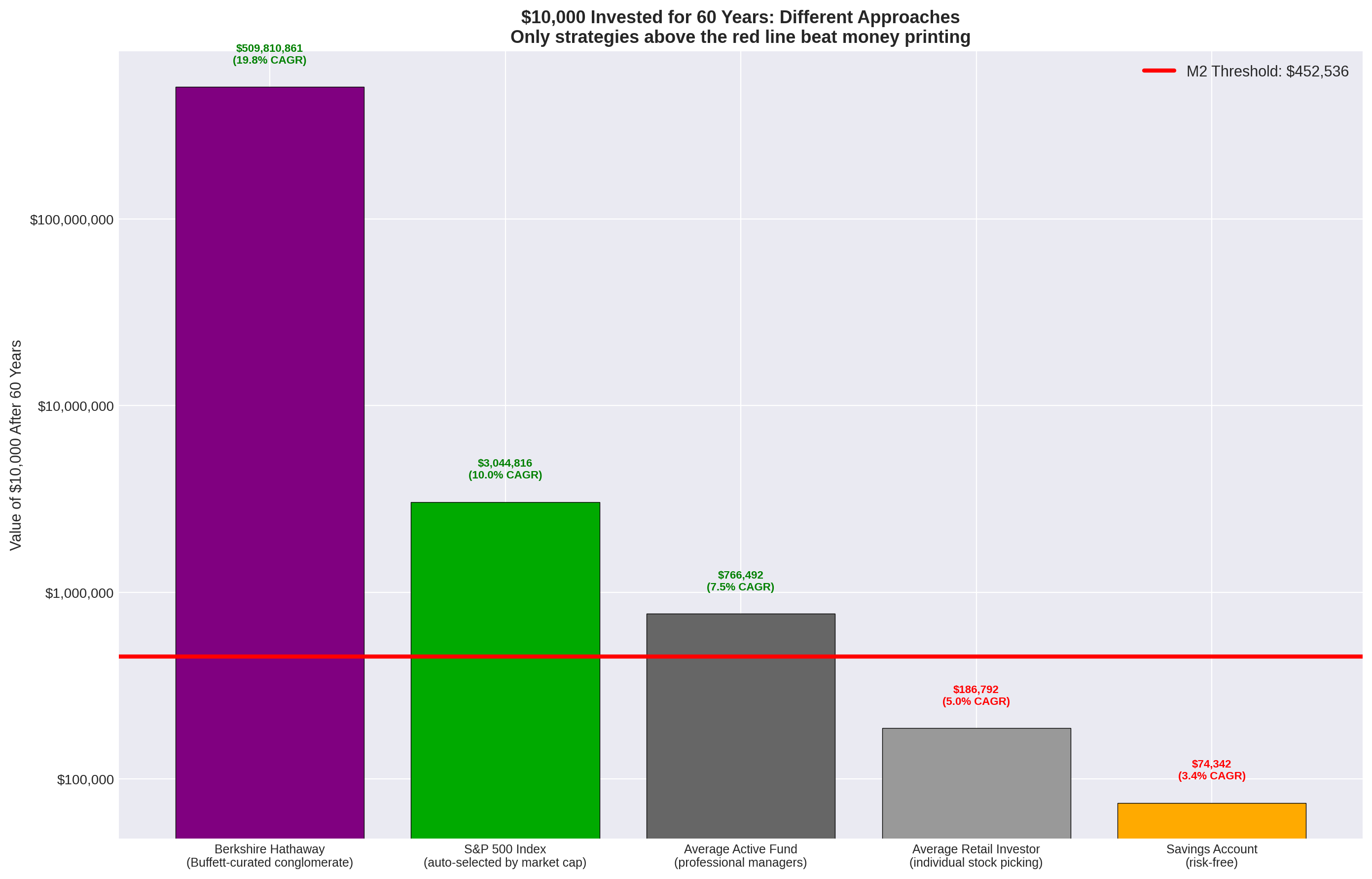
The chart above shows how far the outcomes diverged depending on the approach taken. The average retail investor, trying to pick stocks without the benefit of hindsight, historically achieved around a 5% CAGR [7], which meant they actually lost purchasing power to the 6.56% monetary expansion rate.
That is why we treat Berkshire Hathaway as the anomaly of the period, since a single ticker symbol gave its holders the extreme outperformance of a successful IPO pick while carrying something much closer to the diversified safety of an index fund.
Conclusion: The Setup for the Digital Age
For the majority of the 20th century, the rules of the game were clear. To beat the printing press, you had to either:
- A) Accept the passive 10% CAGR of the S&P 500 and wait 60 years.
- B) Possess the extreme luck required to pick the next Walmart at its IPO.
- C) Outsource your capital allocation to Warren Buffett.
Whichever of those routes someone took, the critical ingredient was time, because it took 40 to 60 years for these compounding machines to achieve escape velocity from the expanding money supply.
But what happens when we look at the modern era?
In the last 30 years, the rate of money printing has accelerated dramatically. Have the traditional winners been able to keep up with this new pace? And more importantly, has the digital age (through the Nasdaq tech boom in Apple, Microsoft, Amazon, and Nvidia, or the invention of decentralised digital scarcity in Bitcoin) finally provided an asset class capable of outrunning the printing press in a fraction of the time?
Have the new digital assets achieved in 15 to 30 years what Berkshire and Walmart took 60 years to accomplish?
That is the question we will answer in Part V: The Digital Shift (1995–2025).
References
- [1] Macrotrends LLC. “Historical Stock Price Data (MCD, WMT, NKE, COST, HD, SBUX).”
- [2] Yahoo Finance. “Historical Price Data and Splits.”
- [3] Federal Reserve Economic Data (FRED). “M2 Money Supply (M2SL).” Federal Reserve Bank of St. Louis.
- [4] Ritter, Jay R. “Initial Public Offerings: Updated Statistics.” University of Florida, 2026.
- [5] Gao, Xiaohui, Jay R. Ritter, and Zhongyan Zhu. “Where Have All the IPOs Gone?” Journal of Financial and Quantitative Analysis, 2013.
- [6] Damodaran, Aswath. “Historical Returns on Stocks, Bonds and Bills: 1928–2025.” NYU Stern School of Business.
- [7] Dalbar Inc. “Quantitative Analysis of Investor Behavior (QAIB) Report.”


